If you read my earlier post about Visuals MCP, you saw how an MCP server can render real UI instead of only text responses. Since then, the project has moved forward in a big way.
The most important update is chart support. You can now ask your AI agent to render single charts or complete dashboards on the fly inside the Copilot chat in VS Code.
What Changed Since the First Post
Visuals MCP started with table, list, tree, image, and master detail experiences. The current version adds a dedicated chart tool and a much broader Storybook surface for validating payloads and layouts.
The chart feature supports these chart families:
- Line
- Bar
- Area
- Pie
- Scatter
- Composed
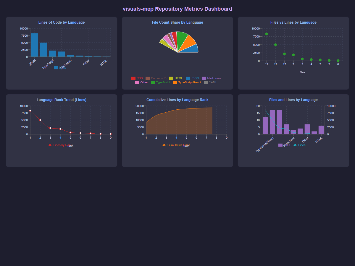
It also supports dashboard style layouts where multiple charts are shown together in vertical, horizontal, or grid mode.
Why This Matters
When agents return plain text summaries, trend analysis is harder than it should be. A chart view gives instant visual context for changes, outliers, and correlations.
For everyday workflows this means you can:
- Compare metrics over time without rewriting markdown tables
- Inspect multiple dimensions in one panel
- Export chart data and visuals for reports
- Keep the interaction inside your editor
Single Charts and Dashboard Views
The chart tool in Visuals MCP is designed for both focused analysis and overview screens.
Single chart workflows are great when you want one clear question answered, for example monthly growth or category distribution.
Dashboard workflows are ideal when you want a quick system level view with multiple chart types side by side.
In Storybook you can validate both patterns before wiring prompts into your MCP workflow:
- Single chart example:
mcp-visuals-chart--line-chart - Multi chart grid example:
mcp-visuals-chart--multiple-charts-grid
Practical Capabilities You Can Use Right Away
The current chart implementation includes practical features that help in day to day work:
- Multiple chart layouts in one render
- Optional legends, tooltips, and grid lines
- Dual axis configurations
- Export options for JSON, CSV, JPG, and SVG
- Theme aware rendering that matches VS Code
These details make the output useful beyond demos. You can move from exploration to documentation without leaving the editor.
Prompt Pattern for On the Fly Dashboards
A simple pattern is to ask for one dashboard with a fixed set of cards:
Build a dashboard with 4 charts in a grid:
1) line chart for weekly active users
2) bar chart for feature usage
3) pie chart for traffic source share
4) composed chart for revenue and cost
Include legends and tooltips and exportable JSON.
This keeps your intent explicit and gives the model clear structure for chart type and placement.
Conclusion
If you already use MCP tools in your daily flow, this is the update that turns analysis from text heavy output into visual interaction. Use the new chart features to get instant visual insights of any data your AI agent can access. Display and/or compare multiple metrics in one view, and export the results for sharing or reporting. The Visuals MCP chart update is a big step towards more interactive and insightful AI agent experiences in VS Code.